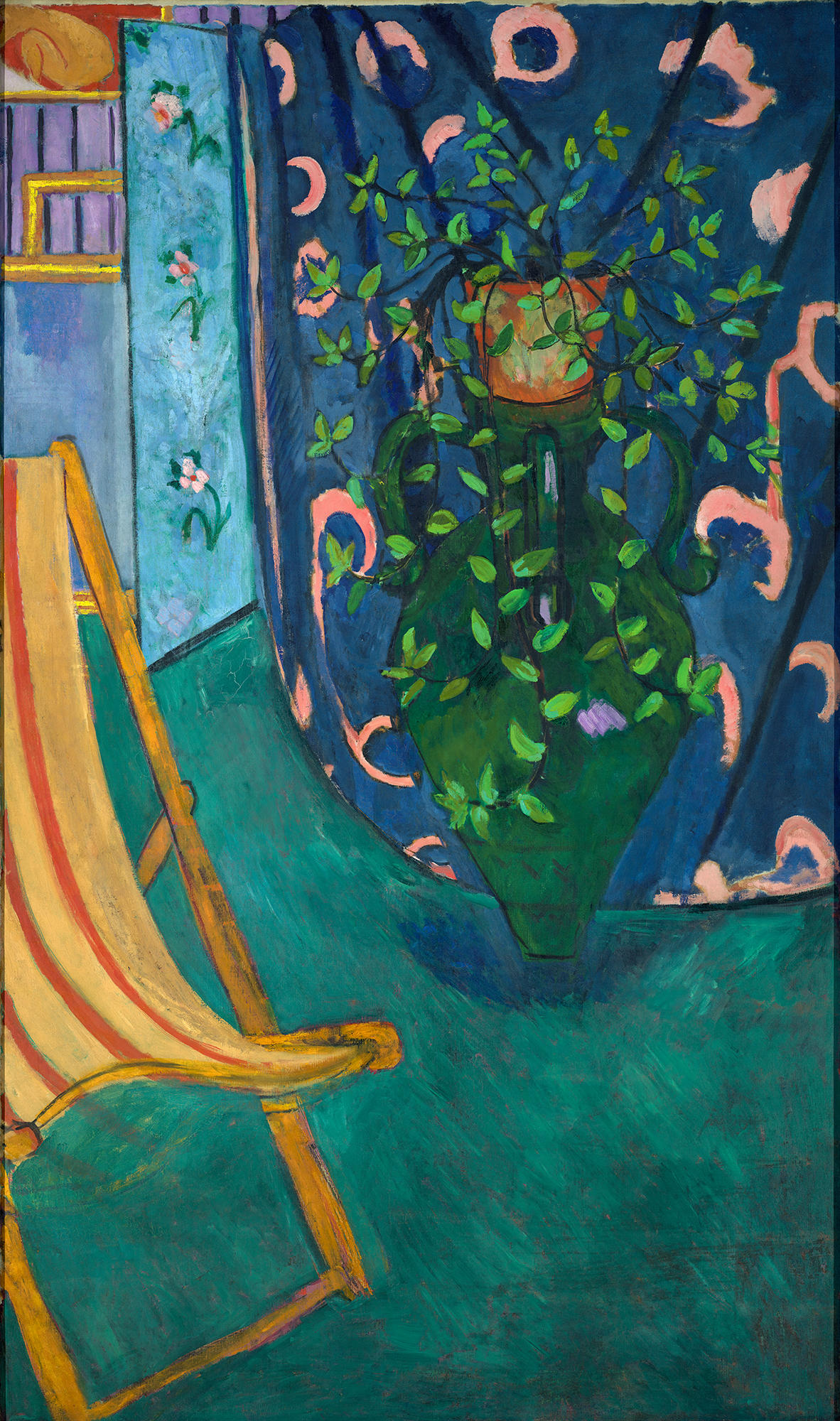
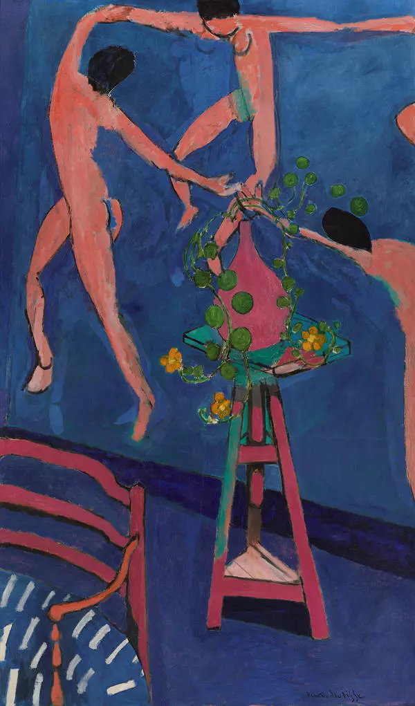
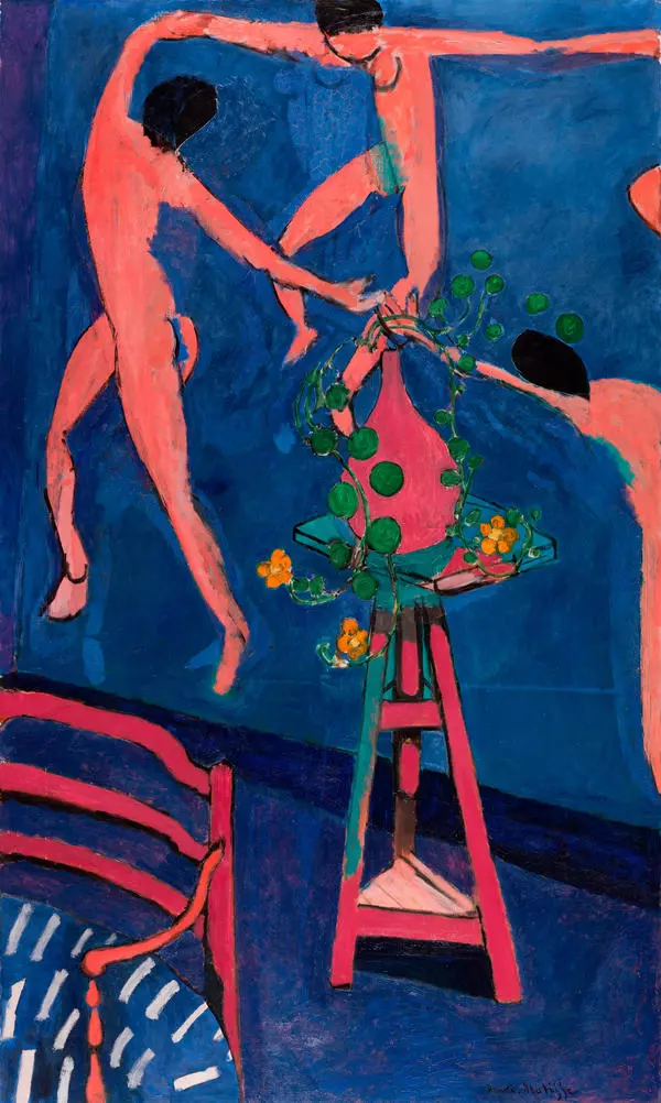
In painting the interior, Matisse uses a fragmentation approach, composition cuts and close-ups. Compared to the painting “Artist’s Studio, " color chords become stronger in the painting Corner of the Artist’s Studio, as if calling for admiration of each object individually. Instead of the rosy floor from the first painting made in 1911, Matisse used emerald hues in “Corner of the Artist’s Studio, " creating a noble feel through the color composition. With the new color composition, the green screen became blue, and the yellow ornament on the blue fabric was replaced with a pink one. On the striped wallpaper beyond the screen we can see a fragment of another painting, “The Luxury II.” On the foreground Matisse painted a chaise longue partially cut off by the frame, as if inviting you to take a seat and meditate over the painting. It’s no coincidence that in his “Notes of a Painter, " Matisse wrote: “I dream of balanced, serene art without a dramatic plot; the kind of art that would soothe a man of intellectual labor, an office worker, a poet or writer, the kind of art that would work like a comfortable chair where you can relax after a hard day’s work.” However, this chair is not only a hint at the presence of a potential viewer, a visitor or a contemplative painter. It also works as a cornerstone of the composition: its curved outline is repeated in the windings of the blue fabric and the interplay of ornamental arabesques on it.
Corner of the Artist’s Studio
Creation period
1912
Dimensions
191,5x114 cm
191,5х114
191,5х114
Technique
oil on canvas
Collection
Exhibition
13
Open in app#1

Henry Matisse
Corner of the Artist’s Studio
#2
read morehide
00:00
00:00
1x
Corner of the Artist’s Studio
Creation period
1912
Dimensions
191,5x114 cm
191,5х114
191,5х114
Technique
oil on canvas
Collection
Exhibition
13
Open in app
Share
