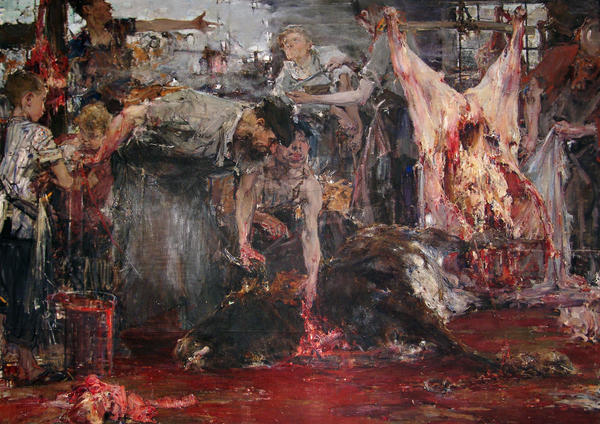
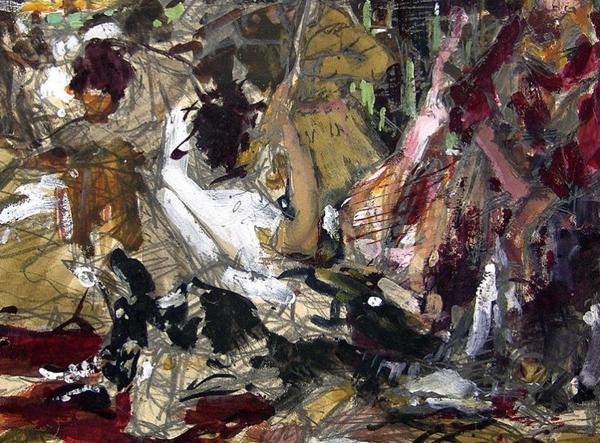
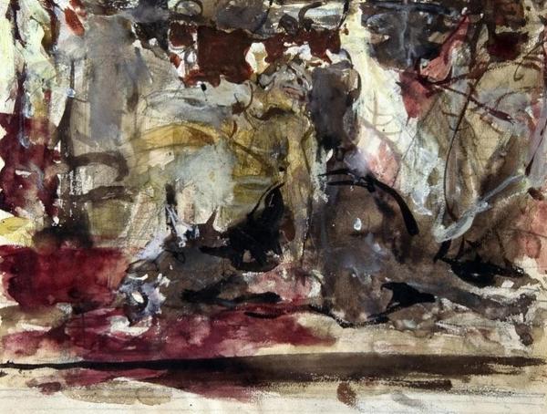
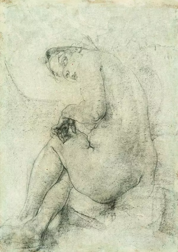
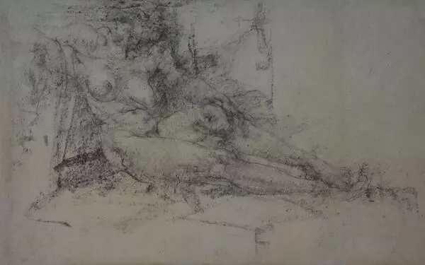
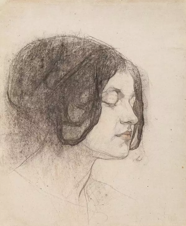
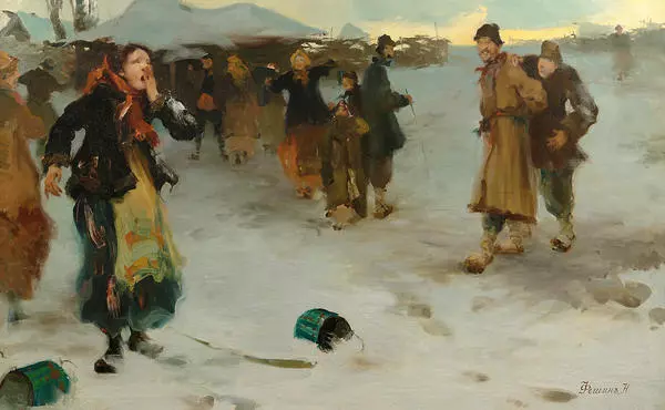
The idea of Slaughterhouse painting was conceived in 1904 during Nickolay Feshin’s visit to South Yenisey taiga, where he first saw the process of cattle slaughtering and butchering in villages. The artist found that scene very picturesque and decided to paint it right from nature. However, for a long time he kept drawing sketches and drafts and only 8 year later embarked on a canvas. “I was always … naturally revolted. But then, having made up my mind, I got rid of personal disgust. The blood and creepy eyes of dying animals turned into sparkling emeralds. The eyes surrounded by blood-drenched darkness looked very impressive, so I put them in the spotlight of my painting”, Nickolay Feshin wrote in his autobiography.
The elusive beauty bursting through the anti-aesthetic subject was the contrast, which always attracted the artist. The two extremes (the dressed carcass and the children as the spring of life) are placed symmetrically against the central axis of the canvas. There are two boys on the left trying to blow up a bull’s bladder regardless of the blood pools around. This episode partly relieves the tension of the painting.
Coloristically, the painting is also based on contrasts – it’s the dark and hard bottom against the light and soft top part, the left against the right (the children and the carcass). In Slaughterhouse the artist balances on the thin verge. The appalling subject of the scene should not excite disgust, while its aesthetic form should not overpower the tragic plot.

